Design 4.0

This is now the fourth design update to the site since I first started working on it three years ago. A lot has changed behind the scenes, but there will also visible new additions in this update. I expect add even more as time progresses.
Design I

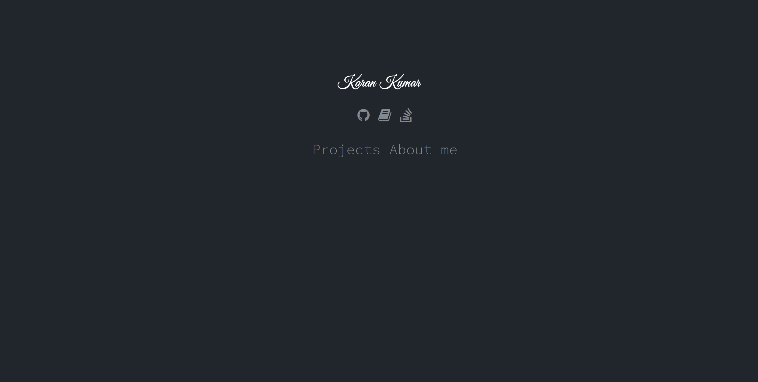
The first design was pure HTML & CSS. By that, I mean I found someone else's design that I liked and reproduced it (making extensive modifications along the way to tailor it to my needs). This was raw. Making updates were tedious and error-prone (I think it didn't work well on Firefox). I should point out that it was only error-prone because I was learning as I was going along.
This was all hosted under GitHub pages, which I have to say was really nice to use. The site domain was knjk04.github.io, which eventually became presentedbykaran.com (which I no longer own).
Design II

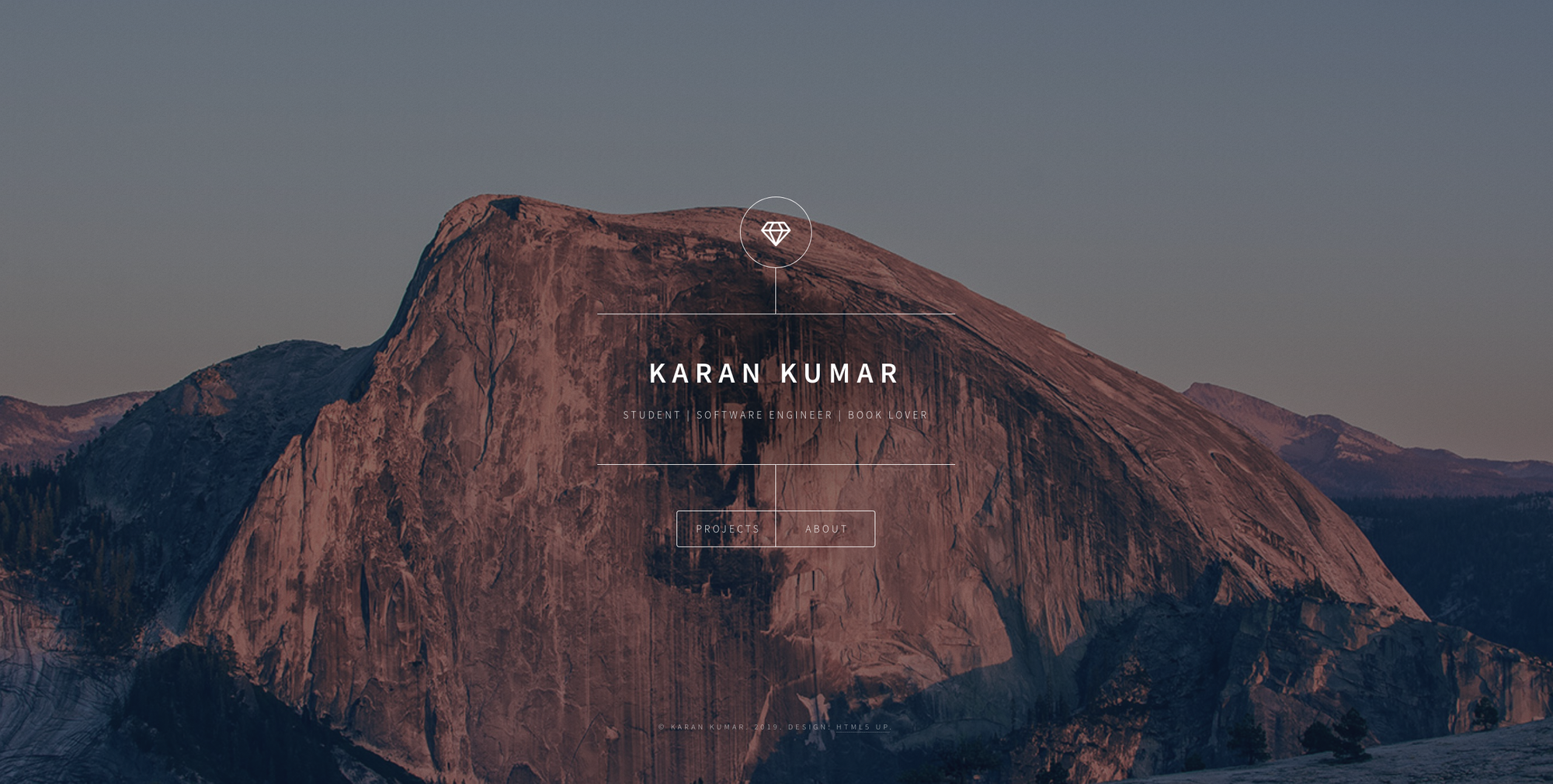
As time wore on, I started to desire a new and better design. The pleasure of hacking my own site together lost its appeal as it dawned upon me that I could have a better site if I used a theme. It was at this point that I stumbled along a friend's site and saw they were using a HTML5 UP! (emphasis not mine) template. Dimension caught me eye and I ended up using it for the site.
I have to say that HTML5 UP! make some great themes. It was easy to modify and extend to my needs, and I thought (and still think) the theme looks great! Unlike the first design I had, it was also responsive, so it worked nicely on mobile.
Content-wise, this was mostly the same as the first design. However, as I started to work on some programming side projects, I added a page to the site to explain what they were.
Design III

Design 2.0 was nice, but I wanted a theme that was more conducive to writing articles. One of my favourite blog sites is Bill Gates's. In fact, I had in mind that I wanted something like this early on. Instead of presentedbykaran.com, I considered something like kumarnotes.com, but went for something a little more original.
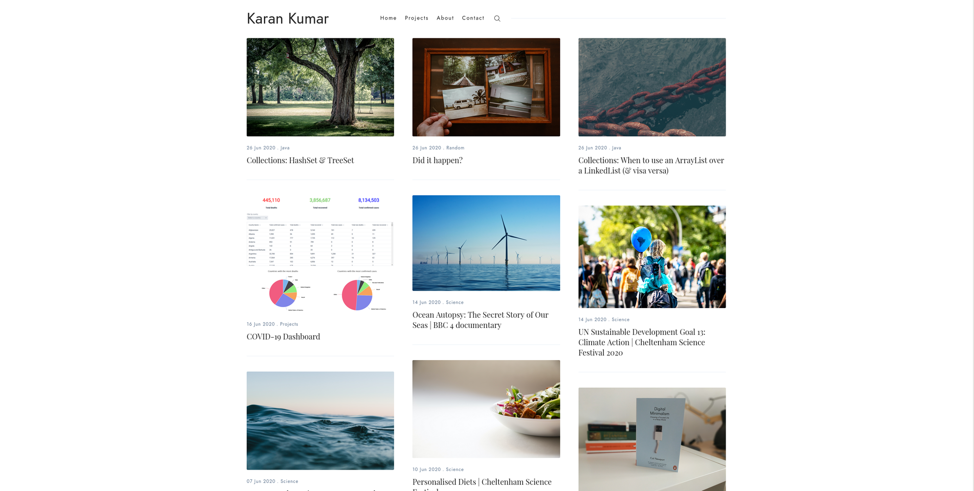
With design 3.0, I decided to use Jekyll. The Sinai theme was a great theme to use. It looks great (very minimal) and it's quick. What's more, the developer, Ahmad Ajmi, is a really nice person who helped me out a couple of times on some small issues.
With this new design came a new domain: karankumar.com. I had wanted this domain from the beginning, but it was taken by someone else (presumably some other Karan Kumar). I kept my eye on this domain from time to time to see whether it had expired yet. When it had, I lept on the opportunity to purchase it. Sadly, it cost a lot, but I really wanted it.
Jekyll allowed me to write articles with ease. It was nice that it integrated well with GitHub pages. I also still admire that there's free SSL with GitHub pages, even when you're using your own domain.
Design IV

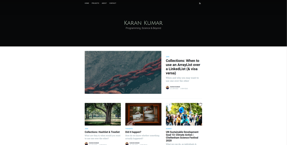
Why the change if everything was so rosy? I was looking for a new theme and I quite liked the ones on Ghost (the Sinai theme, which I am now no longer using, also works better with Ghost). Ghost also is very nice for writing articles: it's clean, simple, no-fuss and has lots of nice features and integrations.
With Ghost, I have got things like tags, RSS and subscriptions to work easily.


